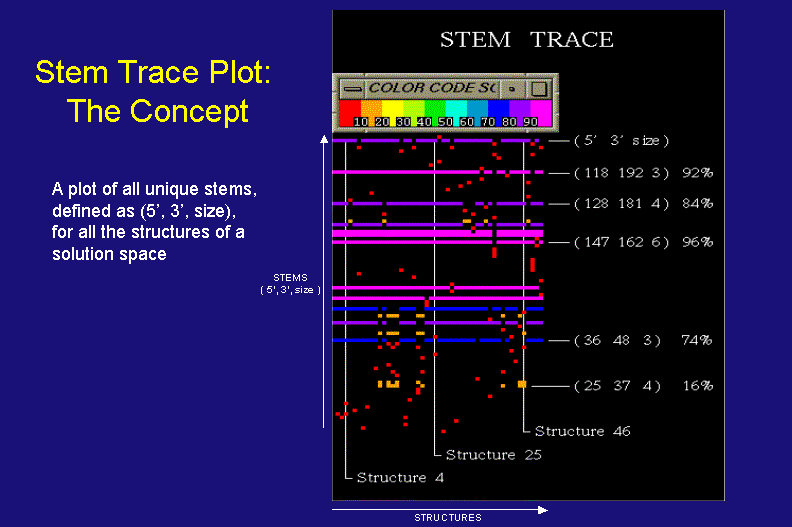
Stem Trace: The Concept
Stem Trace vs. Stem Histogram Data Representation
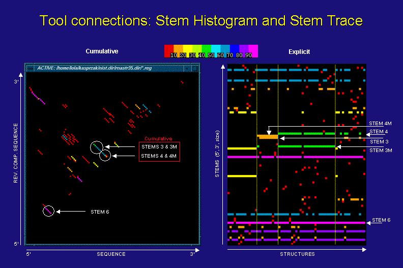
The above figures show a stem histogram (left) and a stem trace (right) of the same secondary structure solution spaces for four different sequences of the same length (computed by a DPA, sequence info. not essential to this discussion). The key point illustrated here is the cumulative data depiction in stem histogram plots and the explicit nature of stem traces.
Let us concentrate on the examples of stem 3 and 3M (mutated), as they are depicted in the two plots. From the stem histogram you can see that the diagonal corresponding to them shows a frequency difference in two base-pairs. This is a footprint of ovelapping stems, but we can not tell for sure how many stems of varying length and frequency contribute to this cumulative result, or with which particular solution structures they may be associated. In contrast, the stem trace of the same data shows clearly with which structures and sequences stems 3 and 3M are associated and how frequently. What is less graphically obvious is how close to each other these stems are. However, this positional information is displayed in the Stem Trace Control Window (not shown) when the user moves a mouse pointer over a stem of interest.
Stem Trace: Interpretation and 2D Drawing Links
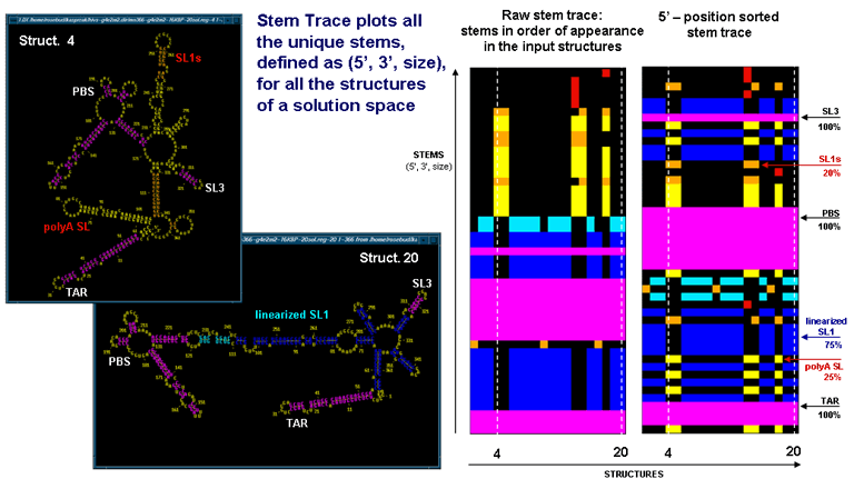
The above figures illustrate the relationship between the stem traces and secondary structured endoded in the plots. The data corresponds to the final results of 20 MPGAfold runs for the 366nt fragment of 5' UTR of HIV-1 MN sequence. The two Stem Trace plots on the right show the raw stem trace of the data, i.e. the trace displayimg stems in order of appearance in the solution space structures, and a plot of stems sorted in their 5'-position order. On the left you can see two secondary strucure drawings, corresponding to the 4-th and 20-th structures, highlighted by the dashed vertical lines on the stem traces. The stem traces shown capture two alternative conformations of the HIV-1 leader region, the so-called BMH (branched) type (in 25% of the solutions shown), and the LDI (linear) strucure (in 75% of the solutions shown). Color-coding is based on the frequency of appearance in the solution space.
The stem trace figures highlight relative merits of the raw and the sorted stem trace representations. The raw stem trace makes it easy to see the consistency of the solutions. In addition, it is easy to see the clusters of substantially different structures, such as the 4-th BMH structure(marked). On the other hand, the 5'-position sorted stem trace makes it easier to search for particular stems and identify which stems on the plot correspond to which stems on the 2D drawings.
Single Strand Trace: A Complementary View of Data
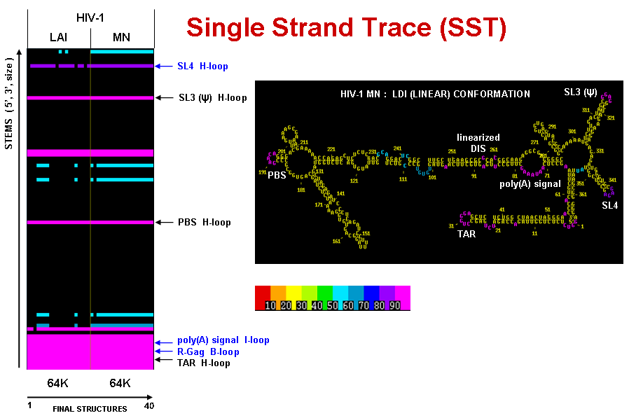
Derived from a Stem Trace plot of solution space, a Single Strand Trace is a complementary plot of all single stranded regions. Free ends, hairpin loops and bulges are plotted as single regions, whereas internal and multi-branch loops are ploted as separate single strands.
The figures below show a Single Strand Trace plot for two HIV-1 strains (LAI and MN) , compared side-by-side (see Multi-Sequence Stem Trace section below for information on alignment). For each strain their single stranded regions from the final results of 20 MPGAfold runs are shown. The results are thresholded at 50% frequency level. The high frequency single strands annotates on the SST plot are color-coded on the secondary structure (LDI-type conformer) of HIV-1 MN.
Multi-Sequence Stem Trace (MPGAfold data)
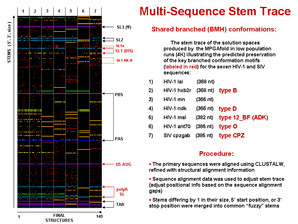
This figure is a 5'-position sorted stem trace of the final results of the MPGAfold folding runs for 7 strains of HIV-1 and SIV. The sequences folded (368nt for LAI and aligned equivalents for other strains) come from the HIV dimerization site and begin with the TAR region. The alignment of the stems shown in this picture is based on sequence alignments produced by the GCG's PILEUP utility further refined with structural information via RNAMot/LispMot module ((Kasprzak and Shapiro 1999)).

Multiple Solution Space Stem Trace (MPGAfold data)
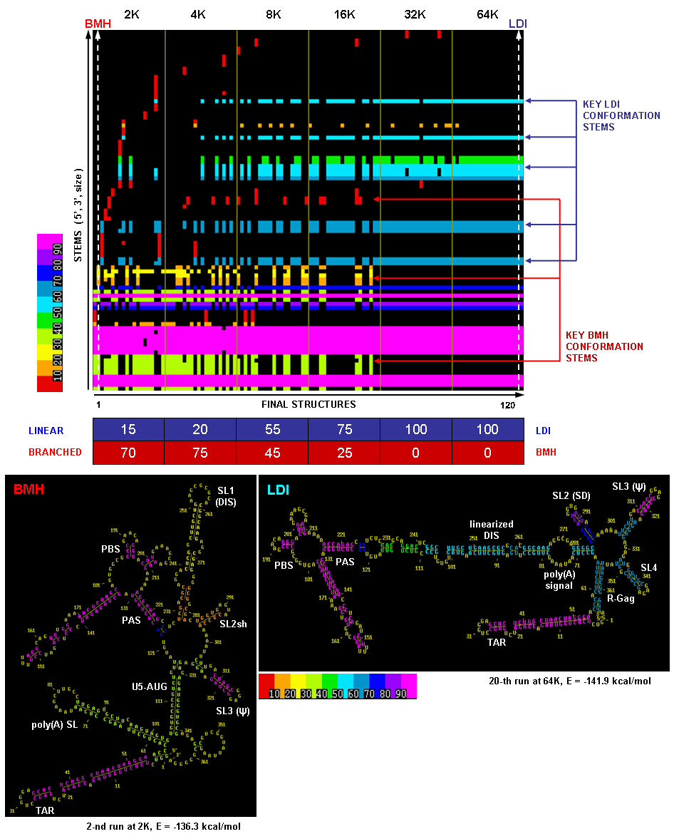
This figure illustrates a raw (unsorted) stem trace of the final results of MPGAfold runs with varying MPGAfold population sizes (numbers of structures maturing in parallel), ranging from 2K to 64K (K = 1,024), 20 runs at each population level. The 366nt-long sequence folded here is the HIV-1 MN 5' UTR domain and begins with the TAR region.
The population variation method is used with MPGAfold runs to capture siginficant structural intermediates. In this case, as one can see from the Stem Trace plot and the percentages listed in the table below it, the lower population results are dominated by the so-called BMH conformation (branched structure, in which the Dimer Initiation Site's self-complementary hexamer - marked as DIS - is exposed in a hairpin loop), while the higher population runs converge to the LDI conformation (linear structure occluding DIS in long distance interactions). The transition from one conformation to the other is strikingly evident in the plot. Sample secondary structures depicting these conformation types are shown below the Stem Trace plot. These results correspond to the published in vitro results. Refer to (Kasprzak and Shapiro 1999) for more on Stem Trace tools.
Stem Trace: Datamining the Visualized Data (MPGAfold data)
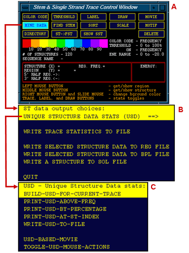
The three windows shown to the left are (A) the Stem Trace Control Window, (B) Stem Trace Data OutputUnique menu and (C) Unique Structure Data sub-menu. The last menu allows the user to generate statistical output for all unique structures depicted in the currently served Stem Trace plot (one Control Window is provided for multiple Stem Trace plots). A database of the Unique Structures can be build and written out to a plain text file or mined for specific areas of interest.
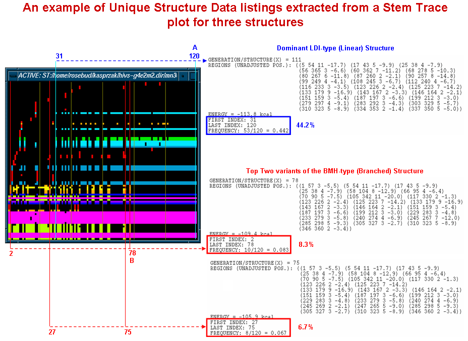
The diagram shown below depicts samples of the Unique Structure Data output obtained from a stem trace of the HIV-1 MN (366nt, 5' UTR) folding results produced by our MPGAfold program run with multiple population sizes. The same data is illustrated above in more detail and from a different perspective. The blue and red annotations to the multiple solution space stem trace show the ties between the output data and the locations and ranges in which the specific structures are found in the plot. The dominant LDI (linear, in blue) structure and the two most frequent BMH (branched, in red) structures are listed. The output listings include structural information in the form of region lists, frequencies of occurrence and ranges (first and last appearance). Thus, for example, the dominant LDI structure appeared between postions 31 (i.e. 11th 4K population MPGAfold run) and 120 (20th 64K population MPGAfold run) with a total frequency of 44.2%.
Stem Trace: DPA Solution Space Example
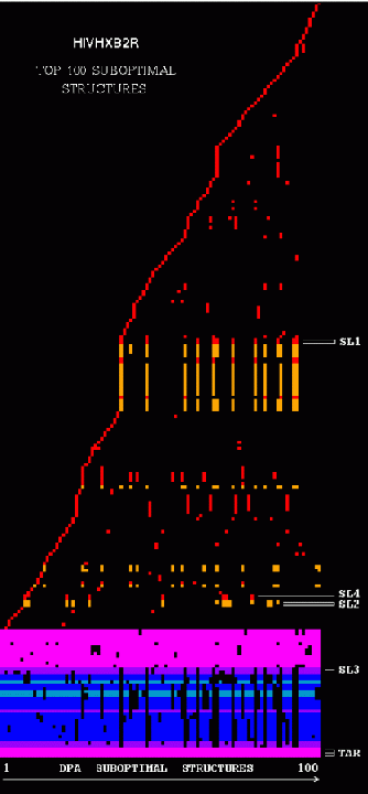
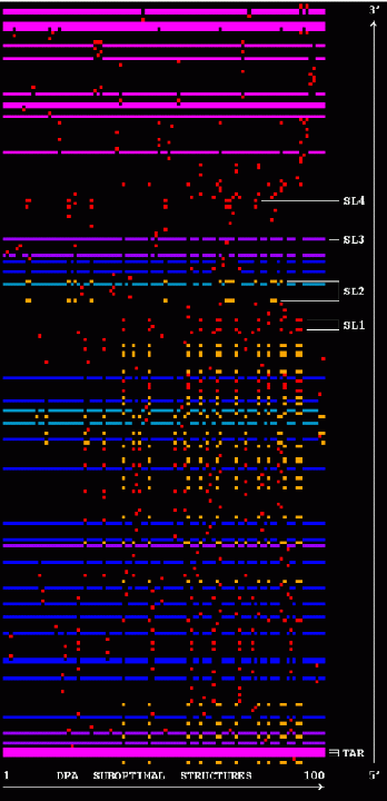
The two figures show stem traces of the top 100 suboptimal secondary structures computed by a DPA (Dynamic Programming Algorithm) for the HIV-1 strain HXB2R in the dimerization region, 562 nucleotides long. The left picture shows the stems in order of appearance in the solution space, whereas the right picture shows them sorted in their 5'-position order. The optimal structure corresponds to the left-most vertical 'slice' of the trace.
